
REPUBLIC, Mo. (AP) - This spring, the city of Republic decided to consider changing its city flag.
The reasoning was pretty simple. The city's flag supply was running low, and more would need to be ordered soon. The thinking was that a new design could incorporate the city logo adopted in 2009 - a large "R," with a leafy green shoot weaving through it.
The Springfield News-Leader reports (http://sgfnow.co/2aGdtqd ) that at a late March meeting, City Council made the first pass through a variety of designs. At one point, Mayor Brian Buckner stood up, gesturing toward the city flag held out behind him.
The top of the flag read "Republic," the bottom "Growing With the Ozarks." In the middle was the city seal, a large oval divided into four quadrants - three containing symbols, the fourth an empty field of white. What if, Buckner proposed, the large "R'' was placed in the quadrant currently without a symbol?
"I like the fact that the white space is the white space," councilman John Jones replied.
"Yeah, I think we want to leave the white space," then-councilwoman Kathy Haralson quickly added.
Why such a reaction regarding a blank space? Sometime within the last 17 years, it's now clear, the portion of Republic's seal without a symbol became symbolic in and of itself.
The spot wasn't always empty. When it was adopted in 1991, Republic's seal contained four symbols, one in each quadrant.
In one, an outline of the state of Missouri. In another, an outstretched hand. In the third, silhouettes of two adults and two children. And in the lower left-hand quadrant, an ichthus - often called the "Jesus fish," and regarded as a symbol of Christianity.
That fish became the center of controversy in 1998, when the American Civil Liberties Union sued the city on behalf of a Republic resident, alleging the seal constituted government endorsement of religion. The resident, a Wiccan, said she felt pressured to conceal her religious beliefs for fear they were unwelcome in a town that touted Christianity in its logo.
The city argued the symbol was intended to show community values and didn't constitute a religious endorsement. A judge, however, ruled in favor of the ACLU the next year. The city was ordered to remove the ichthus from the seal.
After briefly considering an appeal, the city complied with the order. The ichthus was removed. And it was not replaced with anything.
It's not clear if the spot was left blank as a form of silent protest, or whether city leaders at the time just wanted to move on. Regardless, the city flag waved in the wind for years, with the modified seal front and center. Republic grew - from about 8,000 people at the turn of the millennium to some 16,000 today.
At the March meeting, with the flag supply running low, the council considered five proposed designs, which had been winnowed down from a larger number.
The city didn't hire a design firm. Instead, City Councilman Daniel Harter told the News-Leader, council members and city staff drew up possibilities.
All five designs featured the colors orange and black, to match those used by the city's school system. None of the five designs featured the seal.
Councilwoman Gerry Pool argued for keeping the old flag. She indicated that the seal was her primary reason - she didn't want its backstory forgotten.
"I just know that unless you lived in Republic and went through the battle with ACLU, you'd have no idea what we went through to get this far with that flag," she said at the meeting. "I'd like to see us keep that flag."
Jones said he agreed "on the significance of what the flag symbolizes."
"What it has done is created a lot of good conversation with newer Republic residents as to what it means and why it is the way that it is," he said.
Jones suggested that, rather than keeping the old flag, the seal be incorporated into the newer designs. Council tabled the issue and drew up six additional possibilities.
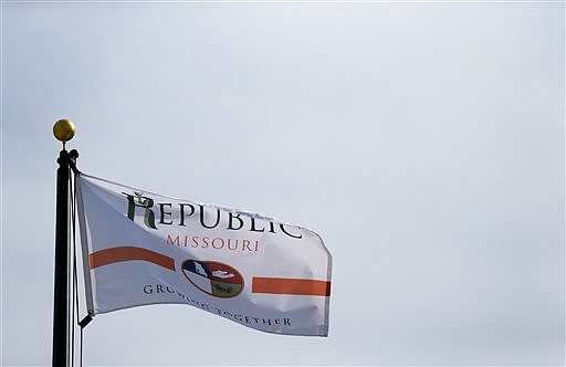
At a meeting in late April, Council voted 6-2 in favor of option No. 7, which Jones had designed. The top of the flag reads "Republic, Missouri," complete with the large R and the fledgling plant life. The bottom reads "Growing Together," the updated city motto. In the middle, between thin bands of orange, is the seal.
It's not entirely the same. Jones told the News-Leader that during the design process, he realized the symbols within the quadrants were overly pixelated in digital form. So he modified them somewhat.
On the new city flag - which began flying at the end of June - the outline of Missouri is a little crisper. The outstretched hand is more detailed. The silhouettes are easier to see.
The blank space, however, remains a blank space.
___
Information from: Springfield News-Leader, http://www.news-leader.com